
 HOME
HOME
Signature
- Signature is used in all media and represents the concept of the agency. It cannot be arbitrarily changed, and it should utilize the data provided by the guard.
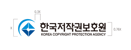
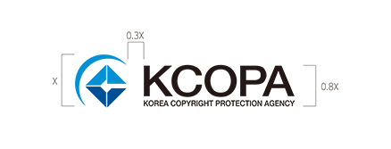
Horizontal Version
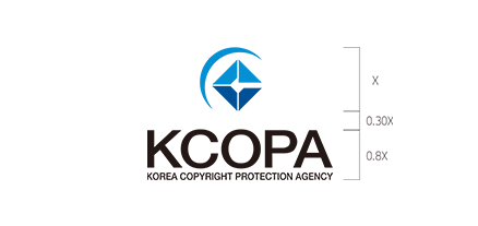
Perpendicular Version

Summary
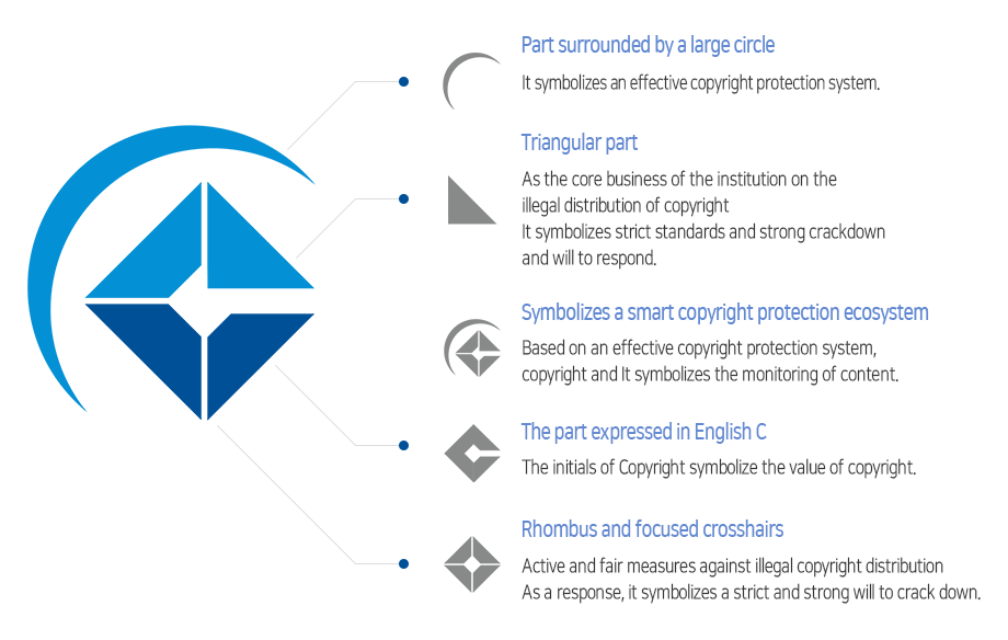
- The symbol mark symbolizes the purpose of Korea Copyright Protection Agency to become a control tower for copyright protection and re-establish the value of copyright and to promote the correct application of copyright protection in productions and distributions. And it also symbolizes the agency's roles to compose an ecosystem for copyright protection and encourage people's voluntary monitoring by improving the domestic and foreign copyright protection system.
Intention in Design
- Symbolizing the C for copyright with the rhombus indicates strong willingness to protect the value of the copyright. The cross lines in the rhombus indicates a willingness to take active and fair responses to illegal copyright distribution. Blue Color symbolizes an effective and smart copyright protection system, symbolizing the leading role of all citizens in creating copyright and protection ecosystem, which is the major purpose of copyright monitoring.
Color
- Sky Blue color symbolizes a bright, transparent and positive future of copyright distribution. Dark Blue color symbolizes the role and capability of the Korea Copyright Protection Agency to lead a reliable and fair copyright distribution culture through an efficient and smart copyright protection ecosystem.
Designated Color
-
KCOPA
LIGHT BLUEPANTONE 527 C
process c73 m100
r3 g144 b213 -
KCOPA
DARK BLUEPANTONE 294 C
process c100 m58 k21
r0 g80 b152
Secondary Color
-
KCOPA
SILVERPANTONE Cool Gray 10 C
process c73 m100
r136 g135 b136 -
KCOPA
GOLDPANTONE 294 C
process c100 m58 k21
r0 g80 b152
Usage of Color
The arbitrary use of the color and shape will damage the original concepts, so it must be used following the standard color and shape. For special effects, usage of Gold and Silver color is permitted. It should be used correctly referring to the described color specification.
Usage of Color


Symbol mark
Emblem / Badge
The design for both emblem and badge is used in all media and represents the concept of the agency. It cannot be arbitrarily changed, and it should observe the data provided by the agency website when used without official permission. In order to obtain special effects, usage of Gold and Silver color is permitted.